Topic:The bar charts below give information on
road transport in a number of European countries. Summarise the information by selecting and reporting the main features, and
make comparisons where relevant.
The bar charts give information about the kilometers travelled by a person per year (kpy) by car and other modes of commute
as well as the commuting times in minutes per day (mpd) for six European countries, including the average figure for the
European Union.
Overall, it is evident that a higher percentage of Danish people travel by car, bus, train, metro and bike, while travel time is
the highest for the British and the Germans.
Considering car as the medium of transport, the European average was 10,000 kpy with the Danes travelling slightly more than
12,000 kpy, followed by the French at 12,000. The Italians and The British covered between 10,000 to 11,000 kpy while the Germans
and Spanish were at around 9000 kpy. The Danes were also the highest in terms of kpy per person by other modes of transport at
3000, followed by the Italians at 1800 kpy. The other European countries were between 900 to 1200 kpy and the EU average was
1200 kpy.
Commuting time was the highest in the UK with the British spending almost 48 mpd, followed closely by the Germans at 47 md.
The Danes spent around 39 mpd on to and fro travel, the French around 35 mpd, the Spanirads around 31 mpd and the Italians
around 21 mpd, making them the least in terms of commuting time.(227 words)
Topic:The bar chart gives information about the amount of time children spend with their parents.
Summarize the information and make comparisons where possible.

The given graphs delineate the amount of time that children of various age groups (0 to 9 years) tend to spend
with their parents during weekdays in comparison to the time spent during weekends.
Overall, one can say that the time spent with individual parents (father or mother) is
higher on weekdays. However, on weekends the entire family tends to spend longer time together.
On weekdays, it can be noted that children of all five age groups spend the least time with their
fathers ( 1 to 2 hours). On the contrary, all the five age groups of children spend the maximum amount of time with their
mothers ( around 6 hours). However, the entire family does not get to spend much time together on weekdays, just around
0.5 to 1 hour.
Not very surprisingly, the trend is almost reversed on weekends. The
entire family
spends maximum time together, around more than 5 hours in each age group. The children spend the least amount of time
with their fathers and it ranges from 0.25 to 0.75 hours. They spend a little longer time with their mothers,
between 2 to 3.5 hours. (191 words)
Topic:The bar chart shows the percentage of school children learning to play different musical instrument in 2005, 2010, 2015.
Summarize the information and make comparisons were relevant. You have to write a minimum of 150 words.
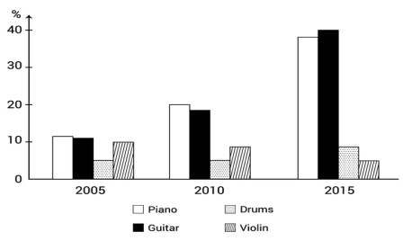
The bar graph reflects the percentage of children opting to learn 4 different musical
instruments in three different years, 2005, 2010 and 2015.
Overall, we can see that most of the children chose to learn to play the piano and guitar
while very few children learnt to play the drums and violin.
In 2005, around 11% of students were learning to play the piano and 10%
the guitar.
This percentage doubled to nearly 20% in the case of piano and 18% for guitar in 2010. Further, in 2015, the percentage
rose/increased significantly to nearly 40% Guitar and 38% piano, making them the most popular instruments to learn to play by
children.
In comparison, in 2005, only 5% students were learning to play the drums.
This percentage remained the same in 2010 also, but it rose slightly in 2015 to 10%. In 2005, 10% children were learning to
play
the violin. This reduced marginally to 9% in 2010 and went further down to 5% in 2015. (191 words).
Topic:The chart below gives some of the most reported issues among people living in UK cities in 2008 (%).
Summarise the information by selecting and reporting the main features, and make comparisons where relevant.
Write at least 150 words.

The given bar graph reflects the percentagewise breakup of 3 problems
faced by inhabitants of 7 big cities of Britain in 2008.
Overall, it is evident that majority of the residents of these 7 cities
faced difficulties with health services while the least complained about air pollution. The dissatisfaction with the
education and training were also significant.
Considering healthcare, more than 50% of the residents of 6 out of the 7 cities
under consideration were unhappy with the services in this sector, with the highest percentages reported from Belfast (59%)
and Cardiff (58%). Only 48% residents of Glasgow reported their displeasure with this sector. In contrast,
a mere 5% of the residents of Newcastle had issues with air quality. The proportion of
air pollution complaints from Belfast, Birmingham and Glasgow were
between 7% and 9%. Around 12% residents of Cardiff had problems with air quality. The ratios were slightly more in London (14%) and
Manchester at around 16%.
Facilities provided in Education and training were also a source of
discontentment for
the residents in these 7 cities with more than 50% people from Belfast, Birmingham, Cardiff, Glasgow, and London complaining about it.
The dissatisfaction levels with this sector were marginally lower among the residents of Manchester at 45%
and 48% in Newcastle. (210 words).
Topic:The bar chart shows the proportion
of the population aged over 65 and above of three countries in 1980 and 2000 along with predictions of 2030. Summarize the
information and make comparisons where possible.

We have been given a bar graph which reflects the percentagewise breakup of
the residents
of three countries who are 65+ years old. The data is of two years 1980 and 2000 and predictions of 2030.
Overall, we can see that the percentage of senior
citizens in Germany were the highest in 1980 and 2000 and is expected to be the most in 2030 also.
In 1980, 15% of the residents of Germany were aged 65+. This ratio
rose to 20% in 2000 and has been projected to touch 25% in 2030.
This was followed by the senior citizens of the UK who were at 14% and 15% in 1980 and 2000 respectively and are expected
to touch 18% in 2030.
In 1980, 15% of the residents of Germany were aged 65+. This ratio
rose to 20% in 2000 and has been projected to touch 25% in 2030.
This was followed by the senior citizens of the UK who were at 14% and 15% in 1980 and 2000 respectively and are expected
to touch 18% in 2030.
In comparison, only 10% of the population of Canada were aged over
65 years in 1980. This percentage increased to 15% in 2000 and has been forecasted at 22% in 2030. (152 words).
Topic:The chart below shows the aid from six
developed countries to developing countries from 2008 to 2010. Summarize the information and make comparisons where relevant.

The given bar graph delineates the funds imparted in billion dollars,
by 6 of the countries of the world to the developing nations over a period of three years.
A glance at the graph reveals that the US gave the most amount of aid
while the Netherlands and Sweden were the least charitable with international aid.
Considering the US, the funds given by them to developing countries in
2008 was around $22 billion. This reduced marginally to $20 billion in 2009, only to rise to $25 billion in 2010,
making it the highest. Germany´s contribution to aid was $10 billion in 2008. The figure rose to $15 billion in the
subsequent year and marginally again to $16 billion in 2010.
In comparison, The UK and Japan´s contribution to aid were almost at
the same level in the three years under consideration between $10 billion to $12 billion. Funds imparted by the Netherlands
and Sweden were on the lower side in the three years when the data was gathered, with the values ranging between $7 and $9
billion. (174 words)
Topic:The chart below shows the amount of money in pounds per week spent on fast foods in Britain. The graph shows the trends in consumption of fast foods. Summarize the
information and make comparisons where possible.

The given bar graph summarizes the weekly average spending on three different junk food, namely Hamburgers, Fish & Chips and Pizza
by people living in the UK, who belong to different income groups (high, average and low). The currency considered is pounds.
A glance at the graph enables us to conclude that most amount of money was spent by the wealthy and middle-income people on
hamburgers while the least amount was spent on pizzas.
Considering the average money spent on hamburgers, around £45 were spent by
the affluent on this fast-food. In comparison, people who earned an average income spent around £34 and the lower
income ones spent only £14. The lowest amount was spent on pizza on the other hand, with the rich spending around
£18, the middle-income people around £11 and the not so
rich people slightly over £35.
Lastly, if we look at the money spent on fish & chips, it was around £16 by
the high-income public, almost £25 by the people who had an average income and roughly £17 by the lower income
people. (180 words).
Topic:
The chart below gives information about the growth of urban population in certain parts of the world including the predictions of
the future. Summarize the information by selecting and reporting the main features and make comparisons where relevant.

We have been given a bar graph which reflects the percentagewise growth of population
globally in two years 1950 and 2000 along with the ratios in 3 regions and the projected future growth in 2030.
Overall, we can see that the global population grew by almost 20% because both Africa
and Latin America went up by around 30%. Further, population of Asia is predicted to increase the most in 2030.
There was 30% growth in global population in 1950 with 11% contribution from Africa,
around 15% by Asia and 40% in Latin America, making it the highest. The world´s population reflected a 20% growth in 2000,
mainly because there was approximately 30% rise in Africa and the Caribbean population to touch 40% and 70% respectively.
Asian population grew only by 25% to reach 40% in 2000.
The global population is expected to hike to 60% with 11% growth in 2030, wherein
Africa will grow to 50%, Asia up to 60% (with almost 20% increase) and the Caribbean to 80%. (169 words).
Location: Vadodara, Gujarat
Renuka Nair, a former banker is the founder of Panache IELTS. She was born and raised in Mumbai and did her schooling from
Apostolic Carmel Convent, a school that believed in holistic education. Despite Malayalam being her mother tongue, English
was her first language of education. The nuances of grammar were inculcated in her during her formative years, along with
creative writing. It was while she was pursuing her Bachelor's degree that she decided to hone her vocabulary. Having completed
her Masters in Mathematics and Computer Science, she started her career in Vadodara, Gujarat in NIIT, teaching C++ to Engineering
students. This was followed by 15 years in the Banking Industry, during the course of which she obtained a PG diploma in Finance.
Wanting to start out on her own, she quit banking in 2012 and started training professionals initially in Corporate Communications, followed
by Spoken English and eventually IELTS, TOEFL, GMAT, and so on.
About us
Specially curated IELTS Reading Tests
Our tutor takes pains to explain the IELTS Reading task to students and we ensure weak students understand this task and
are comfortable with it before conducting mock tests.
A Variety of IELTS Listening Tests
We have a repertoire of Listening Tests that cover all sections from long MCQs to Maps, and confusing Fill-ups.
IELTS Speaking
We conduct one-on-one speaking sessions daily with our students, as a result of which even vernacular students get their desired bands.
IELTS Writing
We encourage our students to practice writing daily. Their writing is thoroghly checked and errors are pointed out.
We also suggest unique vocabulary to ensure our students stand out.


